Bodies
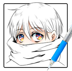
Eyes
Noses, Ears & Mouths
Hair
Chibi Characters
Facial Expressions
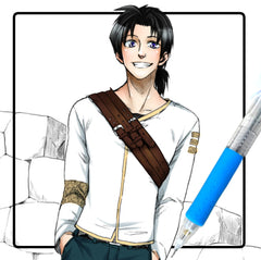
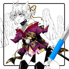
Clothes & Outfits
Ebook Tutorials